
Table of Contents
If you’re a fan of digital planners or project trackers, you know that data is only as good as it looks. Plain numbers are fine, but a visual representation of your progress? That’s where the magic happens.
Adding a Google Sheets sparkline progress bar is one of the easiest ways to level up your spreadsheets. Whether you’re tracking your budget, fitness goals, or a massive to-do list, here is exactly how to build one.
What Kind of Sparklines Can You Create?
While the progress bar is a fan favorite for trackers, Google Sheets offers four distinct chart types to help you visualize different kinds of data:
Win/Loss Charts: A specialized chart that shows positive vs. negative results (like a sports team’s season or a betting log).
Line Charts: The default sparkline. Perfect for showing trends over time, like stock prices or weight loss progress.
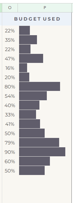
Bar Charts: What we’re using for our progress bar! It’s ideal for showing a single “completion” value or comparing two data points.
Column Charts: Great for comparing a series of values (like monthly sales) in a small, vertical format.
Let’s start with a Google sheets sparkline progress bar tutorial!
Step 1: Calculate Your Success Metric
Before you can build a bar, you need a percentage. You can calculate this in two common ways:
Option A: Financial or Goal Progress
If you are tracking a budget or a specific target, use a simple division formula:
=Paid Money / Budgeted Money

Pro Tip: Use the IFERROR function to keep your sheet clean. If your “budgeted” cell is empty, this prevents that ugly #DIV/0! error from appearing.
=IFERROR(J33/F33, "")
Option B: Task Completion (The Checkbox Method)
Tracking a to-do list? You can count how many checkboxes are ticked compared to the total number of tasks.
=COUNTIF(J9:J33, TRUE) / COUNTA(J9:J33)
- COUNTIF: Counts only the “TRUE” (checked) boxes.
- COUNTA: Counts the total number of cells with text in your task list.
- Result: A decimal number (e.g., 0.5). Make sure to format this cell as a Percentage (%).
Step 2: The Google sheets Sparkline Progress Bar Formula
Now for the fun part. Select the cell where you want the visual bar to appear and paste the following formula:
=SPARKLINE(O33, {“charttype”,”bar”; “max”,1; “color1″,”#615d6c”})
Breaking Down the Formula:
- O33: This is the cell containing your percentage.
- “charttype”,”bar”: Tells Google Sheets to create a solid bar instead of a line graph.
- “max”,1: Since 100% equals 1, this tells the bar to stay contained within the cell limits.
- “color1″,”#615d6c”: This is where you get creative! You can use standard names like “red” or “blue,” or use a custom Hex code to match your brand aesthetic.
Pro tip: Once you have your data, use the official Google SPARKLINE function documentation as a reference to ensure your syntax is perfect. If you are building this for a professional project, remember that sparklines are a powerful tool for visualizing data trends in compact dashboards without cluttering your workspace. Finally, don’t be afraid to get creative with your colors by finding the perfect Hex code for your brand to make your tracker truly yours.
Step 3: Tweak, Style, and Repeat
Once your formula is set, you can drag it down your entire column. This simple addition turns a boring list of numbers into a dynamic, visual dashboard.
Google sheets sparkline progress bar is great because:
- Clarity: You can see progress at a glance without reading numbers.
- Motivation: Watching that bar grow toward 100% provides a natural hit of dopamine.
- Professionalism: It makes your shared sheets look like custom-built apps.
Creating a more functional and beautiful workspace doesn’t require complex coding. It just takes a few smart formulas.
Did you liked my Google Sheets Sparkline Progress bar tutorial? Let me know what do you want to learn next time!
Looking for more? Subscribe to my other newsletters for even more useful tips and insights.
Dream big, live bigger,
Karolina ☁️